Redesigning Meteor JS
I worked with San Francisco based JavaScript platform Meteor JS to redesign their company branding and marketing website. Meteor is a complete open source platform for building web and mobile apps in pure JavaScript. It's fast and easy to use, and already has massive user base with people literally all over the world using it everyday to create apps.
Branding
The process started with the logo – the name Meteor of course lends itself to actual meteors flying through space and by extension space exploration, related technology and even science fiction. Ideas about how I could represent a meteor within the logo itself instantly came to mind, and after a few rounds of iteration and chats with the Meteor team, we decided upon a logo made of individual streaks forming a meteor-like ball set within the name itself. This felt like it worked on multiple levels, it can be used as a single word, but also the meteor icon could be used singularly.
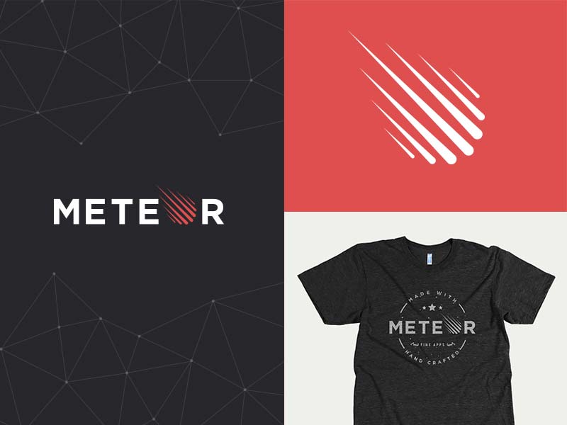
The Meteor team also really liked the idea of using shapes or fractal forms to support the brand, they appear throughout the design and hint at retro computing theme and give a 'spacey' feel, while literally being a structure or platform just like Meteor itself.
Throughout the process I came up with various poster, sticker and t-shirt designs that all support the overall feel of the brand, something that hints at space exploration but is ultimately more serious than the previous incarnation of Meteor, which was little more lose and 'fun' looking.
 Images by Slava Kim, Arnaud Breton, Pascal Richier and Roberto Ferro.
It's so much fun seeing the branding used in so many different ways and on so many different formats.
Marketing Website
After discussing the most important factors on the site with the Meteor team and spending time wire-framing the main pages, I initially tried out a number of different visual routes to experiment. Every project I work on is different but usually I have a clear idea of what I want to achieve before I start the design, other times I find I just have to try out different approaches, which often sparks an idea that sticks. Here are some of the options that didn't make the cut for this project, but were all helpful as the project evolved.
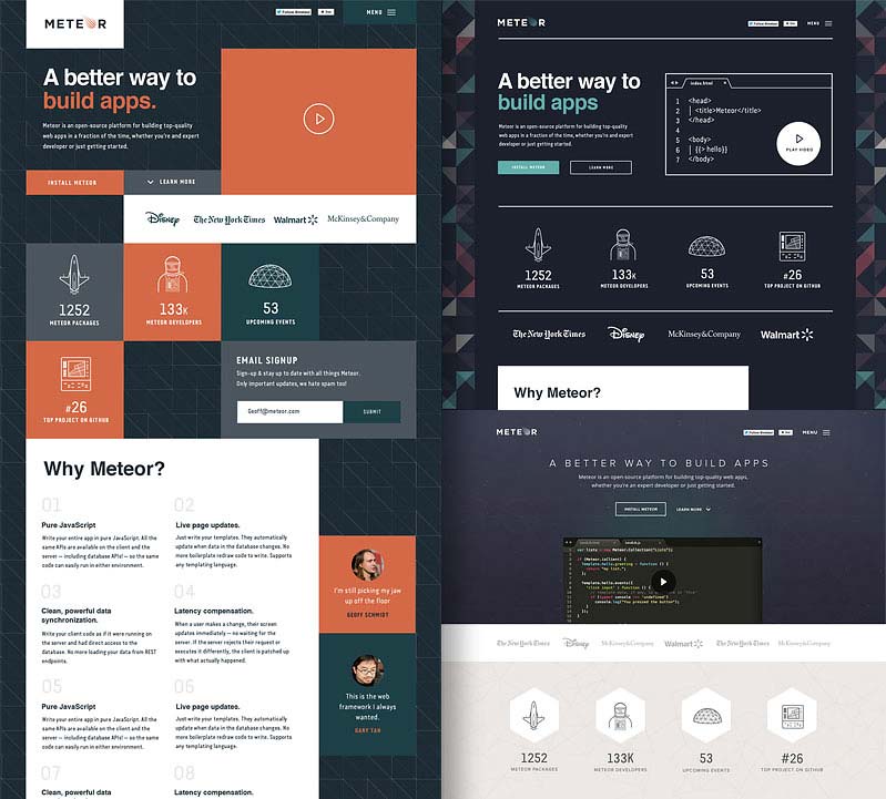
These approaches seemed at odds with the branding and feel I had created initially, so I decided to stick with the tone set during the branding process.
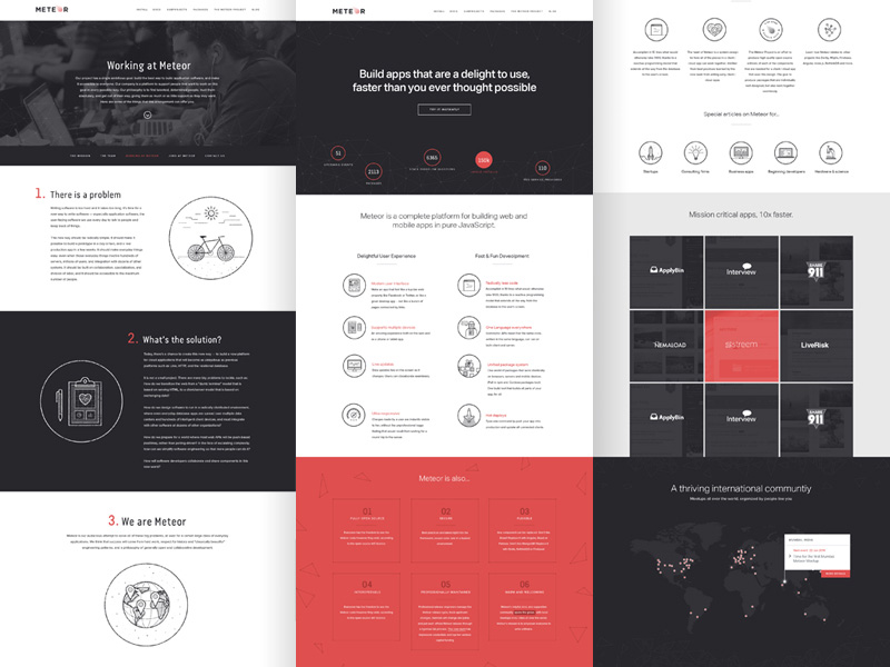
The next step was to create an illustration style to be used at various places throughout the marketing site, which led me onto various other UI elements and styles. I often find this approach useful, to concentrate on the 'assets' for the site, the icons, illustration or photography, and not worry initially about how the site is looking overall. I think this simplistic line based style adds a little bit of character to the brand whilst being a visually descriptive aid on certain areas of the site.
The final site uses a strict colour palette of red, black and white, and combines a typographical approach with large areas of colour and custom illustrated icons, updating the Meteor brand ready for the release of it's version 1.0.
If you are a developer interested in building mobile and web apps I recommend you check out Meteor.
You can see more from screens from this project in my portfolio.